Conda: Myths and Misconceptions

I've spent much of the last decade using Python for my research, teaching Python tools to other scientists and developers, and developing Python tools for efficient data manipulation, scientific and statistical computation, and visualization. The Python-for-data landscape has changed immensely since I first installed NumPy and SciPy from via a flickering CRT display. Among the new developments since those early days, the one with perhaps the broadest impact on my daily work has been the introduction of conda, the open-source cross-platform package manager first released in 2012.

In the four years since its initial release, many words have been spilt introducing conda and espousing its merits, but one thing I have consistently noticed is the number of misconceptions that seem to remain in the (often fervent) discussions surrounding this tool. I hope in this post to do a small part in putting these myths and misconceptions to rest.
Analyzing Pronto CycleShare Data with Python and Pandas

This week Pronto CycleShare, Seattle's Bicycle Share system, turned one year old. To celebrate this, Pronto made available a large cache of data from the first year of operation and announced the Pronto Cycle Share's Data Challenge, which offers prizes for different categories of analysis.

There are a lot of tools out there that you could use to analyze data like this, but my tool of choice is (obviously) Python. In this post, I want to show how you can get started analyzing this data and joining it with other available data sources using the PyData stack, namely NumPy, Pandas, Matplotlib, and Seaborn. Here I'll take a look at some of the basic questions you can answer with this data. Later I hope to find the time to dig deeper and ask some more interesting and creative questions – stay tuned!

Out-of-Core Dataframes in Python: Dask and OpenStreetMap

In recent months, a host of new tools and packages have been announced for working with data at scale in Python. For an excellent and entertaining summary of these, I'd suggest watching Rob Story's Python Data Bikeshed talk from the 2015 PyData Seattle conference. Many of these new scalable data tools are relatively heavy-weight, involving brand new data structures or interfaces to other computing environments, but Dask stands out for its simplicity. Dask is a light-weight framework for working with chunked arrays or dataframes across a variety of computational backends. Under the hood, Dask simply uses standard Python, NumPy, and Pandas commands on each chunk, and transparently executes operations and aggregates results so that you can work with datasets that are larger than your machine's memory.

In this post, I'll take a look at how dask can be useful when looking at a large dataset: the full extracted points of interest from OpenStreetMap. We will use Dask to manipulate and explore the data, and also see the use of matplotlib's Basemap toolkit to visualize the results on a map.

Frequentism and Bayesianism V: Model Selection

Last year I wrote a series of posts comparing frequentist and Bayesian approaches to various problems:

Here I am going to dive into an important topic that I've not yet covered: model selection. We will take a look at this from both a frequentist and Bayesian standpoint, and along the way gain some more insight into the fundamental philosophical divide between frequentist and Bayesian methods, and the practical consequences of this divide.

My quick, TL;DR summary is this: for model selection, frequentist methods tend to be conceptually difficult but computationally straightforward, while Bayesian methods tend to be conceptually straightforward but computationally difficult.

Learning Seattle's Work Habits from Bicycle Counts

Last year I wrote a blog post examining trends in Seattle bicycling and how they relate to weather, daylight, day of the week, and other factors.

Here I want to revisit the same data from a different perspective: rather than making assumptions in order to build models that might describe the data, I'll instead wipe the slate clean and ask what information we can extract from the data themselves, without reliance on any model assumptions. In other words, where the previous post examined the data using a supervised machine learning approach for data modeling, this post will examine the data using an unsupervised learning approach for data exploration.

Along the way, we'll see some examples of importing, transforming, visualizing, and analyzing data in the Python language, using mostly Pandas, Matplotlib, and Scikit-learn. We will also see some real-world examples of the use of unsupervised machine learning algorithms, such as Principal Component Analysis and Gaussian Mixture Models, in exploring and extracting meaning from data.

To spoil the punchline (and perhaps whet your appetite) what we will find is that from analysis of bicycle counts alone, we can make some definite statements about the aggregate work habits of Seattleites who commute by bicycle.

The Model Complexity Myth

An oft-repeated rule of thumb in any sort of statistical model fitting is "you can't fit a model with more parameters than data points". This idea appears to be as wide-spread as it is incorrect. On the contrary, if you construct your models carefully, you can fit models with more parameters than datapoints, and this is much more than mere trivia with which you can impress the nerdiest of your friends: as I will show here, this fact can prove to be very useful in real-world scientific applications.

A model with more parameters than datapoints is known as an under-determined system, and it's a common misperception that such a model cannot be solved in any circumstance. In this post I will consider this misconception, which I like to call the "model complexity myth". I'll start by showing where this model complexity myth holds true, first from from an intuitive point of view, and then from a more mathematically-heavy point of view. I'll build from this mathematical treatment and discuss how underdetermined models may be addressed from a frequentist standpoint, and then from a Bayesian standpoint. (If you're unclear about the general differences between frequentist and Bayesian approaches, I might suggest reading my posts on the subject). Finally, I'll discuss some practical examples of where such an underdetermined model can be useful, and demonstrate one of these examples: quantitatively accounting for measurement biases in scientific data.

Fast Lomb-Scargle Periodograms in Python

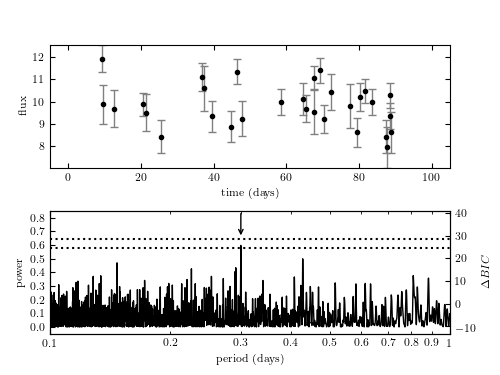
Image source: astroML. Source code here

Edit, Spring 2017: For an in-depth guide to the practical use of Lomb-Scargle periodograms, see the paper discussed in A Practical Guide to the Lomb-Scargle Periodogram.

Edit, Summer 2016: All of the implementations discussed below have been added to AstroPy as of Version 1.2, along with logic to choose the optimal implementation automatically. Read more here: astropy.stats.LombScargle.

The Lomb-Scargle periodogram (named for Lomb (1976) and Scargle (1982)) is a classic method for finding periodicity in irregularly-sampled data. It is in many ways analogous to the more familiar Fourier Power Spectral Density (PSD) often used for detecting periodicity in regularly-sampled data.

Despite the importance of this method, until recently there have not been any (in my opinion) solid implementations of the algorithm available for easy use in Python. That has changed with the introduction of the gatspy package, which I recently released. In this post, I will compare several available Python implementations of the Lomb-Scargle periodogram, and discuss some of the considerations required when using it to analyze data.

To cut to the chase, I'd recommend using the gatspy package for Lomb-Scargle periodograms in Python, and particularly its gatspy.periodic.LombScargleFast algorithm which implements an efficient pure-Python version of Press & Rybicki's $O[N\log N]$ periodogram. Below, I'll dive into the reasons for this recommendation.

Optimizing Python in the Real World: NumPy, Numba, and the NUFFT

Donald Knuth famously quipped that "premature optimization is the root of all evil." The reasons are straightforward: optimized code tends to be much more difficult to read and debug than simpler implementations of the same algorithm, and optimizing too early leads to greater costs down the road. In the Python world, there is another cost to optimization: optimized code often is written in a compiled language like Fortran or C, and this leads to barriers to its development, use, and deployment.

Too often, tutorials about optimizing Python use trivial or toy examples which may not map well to the real world. I've certainly been guilty of this myself. Here, I'm going to take a different route: in this post I will outline the process of understanding, implementing, and optimizing a non-trivial algorithm in Python, in this case the Non-uniform Fast Fourier Transform (NUFFT). Along the way, we'll dig into the process of optimizing Python code, and see how a relatively straightforward pure Python implementation, with a little help from Numba, can be made to nearly match the performance of a highly-optimized Fortran implementation of the same algorithm.

The Hipster Effect: An IPython Interactive Exploration

This week I started seeing references all over the internet to this paper: The Hipster Effect: When Anticonformists All Look The Same. It essentially describes a simple mathematical model which models conformity and non-conformity among a mutually interacting population, and finds some interesting results: namely, conformity among a population of self-conscious non-conformists is similar to a phase transition in a time-delayed thermodynamic system. In other words, with enough hipsters around responding to delayed fashion trends, a plethora of facial hair and fixed gear bikes is a natural result.

Also naturally, upon reading the paper I wanted to try to reproduce the work. The paper solves the problem analytically for a continuous system and shows the precise values of certain phase transitions within the long-term limit of the postulated system. Though such theoretical derivations are useful, I often find it more intuitive to simulate systems like this in a more approximate manner to gain hands-on understanding. By the end of this notebook, we'll be using IPython's incredible interactive widgets to explore how the inputs to this model affect the results.

How Bad Is Your Colormap?

(Or, Why People Hate Jet – and You Should Too)

I made a little code snippet that I find helpful, and you might too:

"""Return a grayscale version of the colormap""" cmap = plt.cm.get_cmap(cmap) colors = cmap(np.arange(cmap.N)) # convert RGBA to perceived greyscale luminance # cf. http://alienryderflex.com/hsp.html RGB_weight = [0.299, 0.587, 0.114] luminance = np.sqrt(np.dot(colors[:, :3] ** 2, RGB_weight)) colors[:, :3] = luminance[:, np.newaxis] return cmap.from_list(cmap.name + "_grayscale", colors, cmap.N)

What this function does is to give you a lumninance-correct grayscale version of any matplotlib colormap. I've found this useful for quickly checking how my plots might appear if printed in black and white, but I think it's probably even more useful for stoking the flame of the internet's general rant against jet.